Dashboards as a Dialogue With Data
How internal AI dashboards help marketing and business teams connect data, find patterns, and make better decisions.
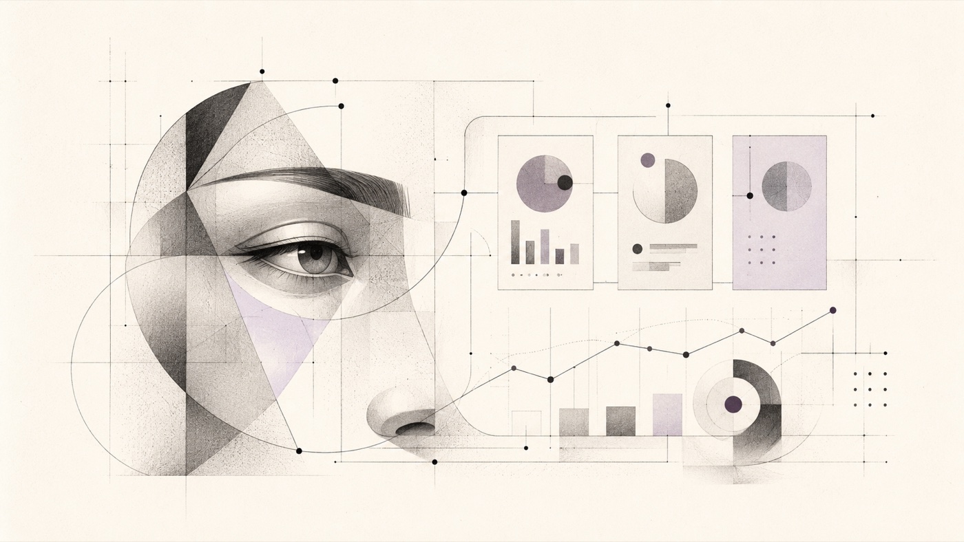
Many dashboards are built with good intentions and weak results. They display numbers, charts, tables, and colourful cards, but after a few weeks the team still returns to gut feeling. Someone opens Analytics, someone else opens Meta Ads, someone else opens a sales spreadsheet. Everyone sees a different slice of reality.
The problem is not that companies do not have data. The problem is that data often does not lead to a better question.
At Women in AI Prague, two useful examples came up. The first was a dashboard for a masterclass that connected campaigns, conversions, and revenue. The second was a dashboard for a podcast studio, where data opened a conversation about performance, retention, margin, and the real impact of clients.
Both cases show that a good dashboard should not only show what happened. It should help the team decide where to look next.
Reporting often shows numbers without context
Marketing teams know the situation: it is time to evaluate a campaign, and everything is somewhere else. Traffic in GA4. Spend and creatives in Meta Ads. Orders in a sales system. Comments and subjective impressions in the team’s heads.
Each tool has its own logic. Each shows a slightly different answer. The result is that a lot of time goes into assembling the picture, and less into making decisions.
The masterclass dashboard in Rybiz Production addressed exactly this problem. According to the source material, it connects GA4, Meta Ads, and SimpleShop into one internal overview. The team can see campaigns, conversions, revenue, traffic, and other data in one place.
That alone is still not enough. It becomes interesting when people can ask questions of the data: what am I looking at? What worked? What repeats? What makes sense to repeat in the next campaign?
Marketing dashboard: campaigns, conversions, and revenue in one place
One specific detail from the transcript stood out: in one masterclass campaign, ads with a shot of the sea behind the person performed very well. Denisa herself said she did not know whether it was the sea or the energy of the people by the sea. The point is elsewhere. The system noticed a pattern the team might have missed.
This is exactly the type of question a good dashboard should open. Not “the sea always works”. But “why did these specific creatives perform better, and what can we test meaningfully next time?”
A reasonable dashboard should not manufacture definitive answers from weak signals. It should show where it is worth thinking.
Podcast studio dashboard: when data corrects intuition
The second example is more sensitive, but very important. In the podcast studio, the team looked at results, services, retention, client return, and margin. According to the transcript, the dashboard helped open questions that would have been hard to address without visualisation. It also showed a case where a client felt unprofitable, but in the data looked like one of the most profitable ones.
This needs to be communicated carefully. A dashboard should not be a tool for quick decisions without context. The strong point is not the hardness of data. The strong point is the correction of a distorted impression.
Data can show that we are looking in the wrong direction. But a human has to decide what follows from it.
The technical layer does not have to be mysterious
The source material for the masterclass dashboard describes a common modern stack: Next.js, React, TypeScript, Tailwind CSS, Recharts, API routes, a custom cache layer, Vercel, and integrations with GA4, Meta Ads, and SimpleShop.
The podcast studio dashboard goes further. It connects Reservio, iDoklad, Freelo, Google Ads, and GA4. It also has an AI/chatbot layer through the Vercel AI SDK and OpenAI. The source material mentions KPIs, clients, red flags, PPC, reports, and alerts.
For a business reader, it is not important to know every framework. What matters is the principle: data does not have to stay scattered across tools. An internal layer can be built above it, showing the team relationships and allowing them to ask questions more naturally.
The human factor stays in interpretation
When asked about the human factor, Denisa said something simple: let the system handle data and reports, but let the decision also be guided by what the brand wants to do, what the team enjoys, and what direction makes sense.
That is a healthy approach. A person does not have to pretend to be a better analytical machine. The person should hold context, taste, strategy, and responsibility.
A dashboard should save the team time when assembling the picture. It should not take away the team’s ability to think.
Three questions for an existing report
Take one report your company already has. Do not start by asking how to rebuild the whole thing. Add three questions to it:
- What looks good here but might be misleading?
- Which result contradicts our intuition?
- What decision will we actually make from this?
If the report cannot help answer these questions, the problem may not be the chart. You may not yet have a dashboard that leads to a decision.